The Aligned Probes Plot
The probe trend plot is a useful way to see if there is a universal
trend which runs over the length of an average probe in a probe
list. The aligned probes plot is a quick way to see if there are
subsets of probes within a list which display a pattern over their
length.
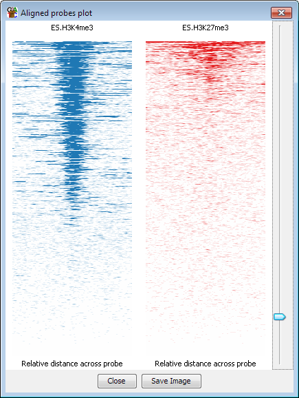
Each horizontal line on the plot represents one probe.
The density of colour across each horizontal line reflects the density
of reads across the probe. The density on each line is normalised to
be independent of the number of reads in that probe.
Options
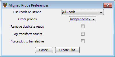
- You can choose to filter the strand of the reads you use
- You can choose how to order the lines in the plot. By default each plot is ordered
independently with the lines going from highest to lowest total count, but if you are
drawing several plots you can choose one of them to define the order and the others
will keep the same ordering
- You can choose to globally correct the counts. Without this option the plot
shows raw read depth. With the option the values are read depth per million reads
of library.
- You can choose to count each read position only once - removing duplicated reads
from the plot
- You can choose to put the colour density on a log scale
- You can force a plot to be relative (uses 200 slots) rather than using bp resolution
even if your probes are all the same length. This may make sense if you have very
long probes