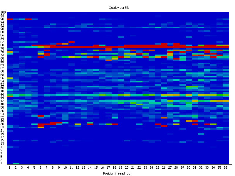
This graph will only appear in your analysis results if you're using an Illumina library which retains its original sequence identifiers. Encoded in these is the flowcell tile from which each read came. The graph allows you to look at the quality scores from each tile across all of your bases to see if there was a loss in quality associated with only one part of the flowcell.
The plot shows the deviation from the average quality for each tile. The colours are on a cold to hot scale, with cold colours being positions where the quality was at or above the average for that base in the run, and hotter colours indicate that a tile had worse qualities than other tiles for that base. In the example below you can see that certain tiles show consistently poor quality. A good plot should be blue all over.
Reasons for seeing warnings or errors on this plot could be transient problems such as bubbles going through the flowcell, or they could be more permanent problems such as smudges on the flowcell or debris inside the flowcell lane.
This module will issue a warning if any tile shows a mean Phred score more than 2 less than the mean for that base across all tiles.
This module will issue a warning if any tile shows a mean Phred score more than 5 less than the mean for that base across all tiles.
Whilst warnings in this module can be triggered by individual specific events we have also observed that greater variation in the phred scores attributed to tiles can also appear when a flowcell is generally overloaded. In this case events appear all over the flowcell rather than being confined to a specific area or range of cycles. We would generally ignore errors which mildly affected a small number of tiles for only 1 or 2 cycles, but would pursue larger effects which showed high deviation in scores, or which persisted for several cycles.